

Rebooting an Esports betting brand.
Askott Entertainment
Rebranding
Logo
Identity System
Since 2012, Askott Entertainment has led the way in the world of esports wagering. They’ve created software that has revolutionized the gaming industry but they were so busy coding that they hadn’t really thought about their brand.
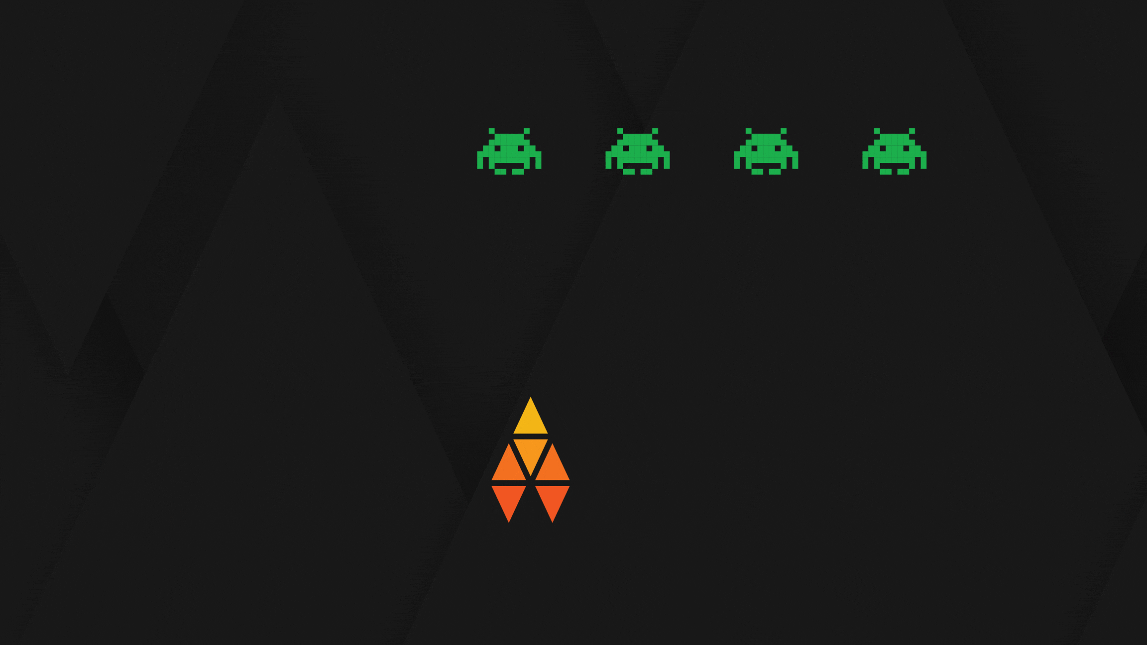
HBM totally rebooted Askott’s brand position, story and most notably, the logo. Every single video game graphic is actually made of triangles - it’s the most efficient way to animate any object or player - so it only made sense to design the Askott logo to be just as powerful and efficient as those graphics.
The six triangles make a stylized A that also directly nods to both a team dynamic, upwards movement and industry-leading objectives of their esports brand. It’s fun and somehow authoritative. Plus, it looks like a fighter jet from an old school video game.


Chameleon Gaming Platform
Askott Entertainment had just completed an amazing new wagering platform that could seamlessly integrate with any client’s site. It was fast. It was simple. And, it had no name or branding whatsoever.
Given the highly adaptable and seamless nature of the wagering platform it’s now called Chameleon. Building on the Askott visual identity system, the triangles are rearranged into a new logo with a new colour palette to distinguish Chameleon from its parent company.

