
Brewing up a good vibes brand in the competitive craft beer market
Brewing August
Brand Strategy
Naming
Logo
Identity System
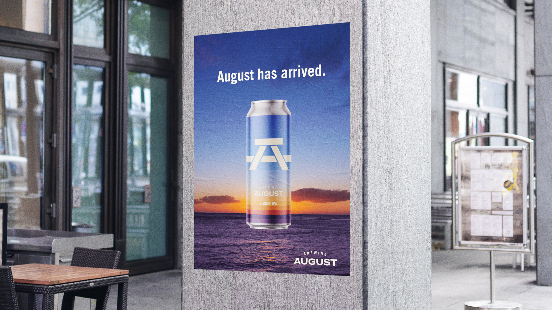
Advertising
Brewing August wasn’t always Brewing August.
In the beginning, it was just two guys that wanted to start a craft brewery in Vancouver with the generic name of Community Beer Corp.
The challenge? There are well over 200 craft breweries in BC with over 500 SKUs. To say it’s a saturated market is an understatement. Within all of that noise, Here Be Monsters noticed a few craft beer cliches to avoid: one, many breweries are just named after their location. Two, most brands go on and on about their ingredients and brewing process. And three, much of the packaging falls into two categories: super boring or super detailed illustrations.


The idea of good people, good places and good times permeated our inspiration. Or in the case of beer, things that taste good make you feel good. So we set upon a new name, logo and packaging that would make the new beer brand stand out from the crowd in a feel-good way.
Here Be Monsters renamed Community Beer Corp. to the much sunnier moniker of Brewing August. The new brand name points directly back to the best month for weather and vibes in Vancouver.
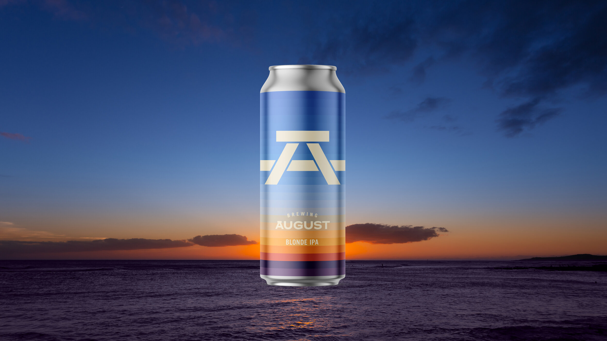
Then we developed several logo designs but the resounding favourite was the simple image of a picnic table. It’s a fun, summery gathering place for friends and family to have a beer together. And when the logo is shown in profile, it becomes a very tasteful letter A.
Perhaps the biggest hurdle to overcome was the packaging itself. We needed a bright beacon to shine from beer fridges throughout town. To match the brand name, we chose to abstract different summery scenes. The first beer, a Blonde IPA, used the warm orange hues of a setting sun on a horizon field of blue swatches. And as other beer types were brewed we continued with more abstracted summer landscapes.
The result is an iconic brand that promises a vacation in a can, any time of year.


Tate Lillies,
Founder & CEO of Brewing August