
Perking up a beloved B2B brand
Canterbury Coffee
Brand Strategy
Brand Writing
Logo
Identity System
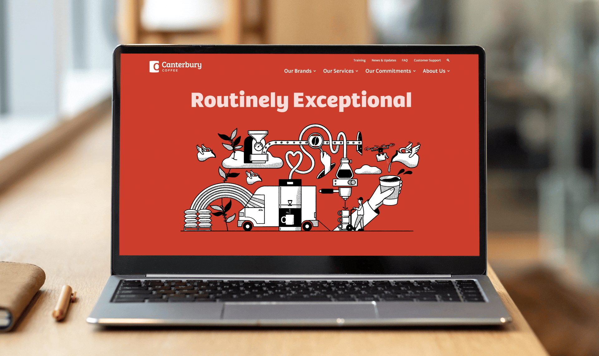
Website Redesign
The coffee industry is competitive.
It has taken Canterbury Coffee over 40 years to become one of Canada’s most dependable B2B coffee companies, establishing itself as a well-regarded roaster and distributor.
There was just one problem, very little work had gone into the Canterbury brand over the last four decades. Like a forgotten cup of joe, the brand had gone cold.
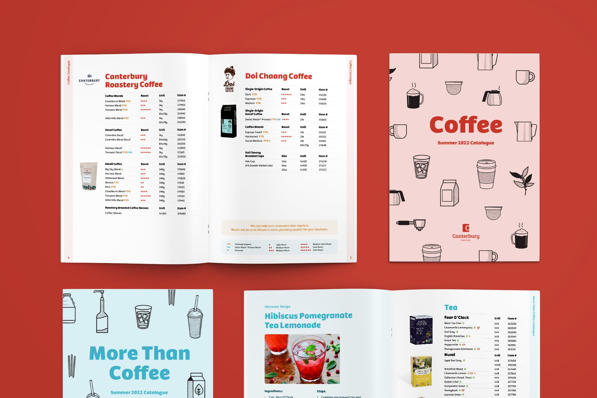
Never ones to turn down a spirited opportunity, Here Be Monsters led their marketing team and execs in a full rebranding process from research and strategy to writing and brand identity, to revamping the website and redesigning the catalogues.
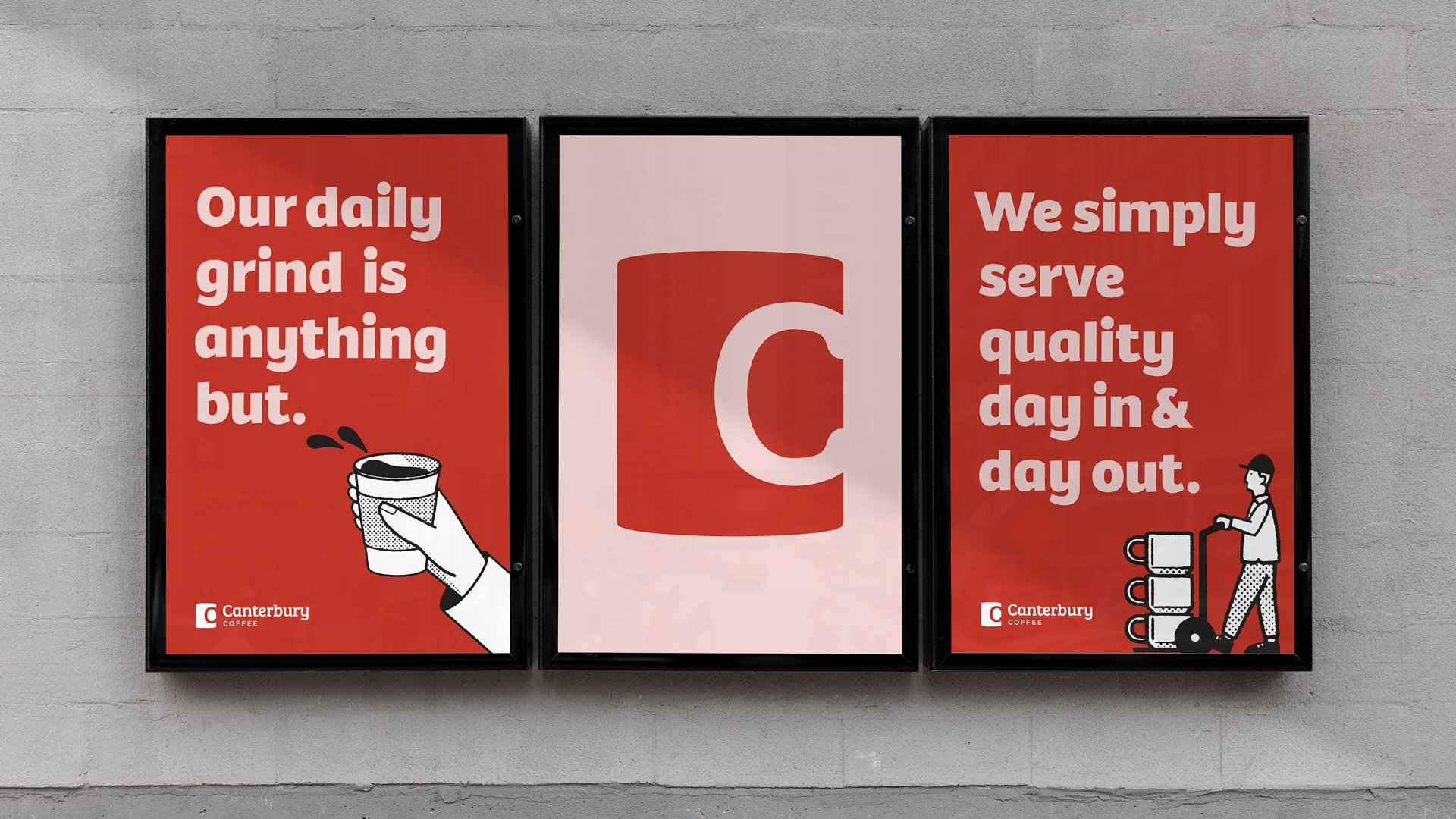
Everything centred around the brand spirit To Be Routinely Exceptional, a promise based not only on Canterbury’s products but more so on their customer service. To embody this promise, we set upon a new logo.
As we all know, good coffee in a favourite mug gives a warm and comfortable feeling. And Canterbury sells good coffee products with warm customer service. So naturally, the new logo is based on a typographic C made from the warm, and iconic handle of a coffee mug.
From there, the identity system followed suit with human-centric illustrations, cozy web icons, personable photography and warmer writing.
Finally, all of those tools were applied to the product catalogues and a brand new website as Canterbury Coffee sets upon the next 40 years of being routinely exceptional.