

Pumping up the approachability for a sports nutrition company
GUD Recovery Drinks
- Ezry Foods Inc.
Brand Story
Identity System
Packaging Design
Early on in our GUD rebranding project, Here Be Monsters hit on an interesting but somewhat obvious insight; people get into sports for enjoyment, especially as kids. And when we really enjoy something we keep going back for more. Then something changes. As we get older, sports, training and physical activity can seem more like work. And the only way to get better is to keep going back for more. But along the way, we lose the joy.

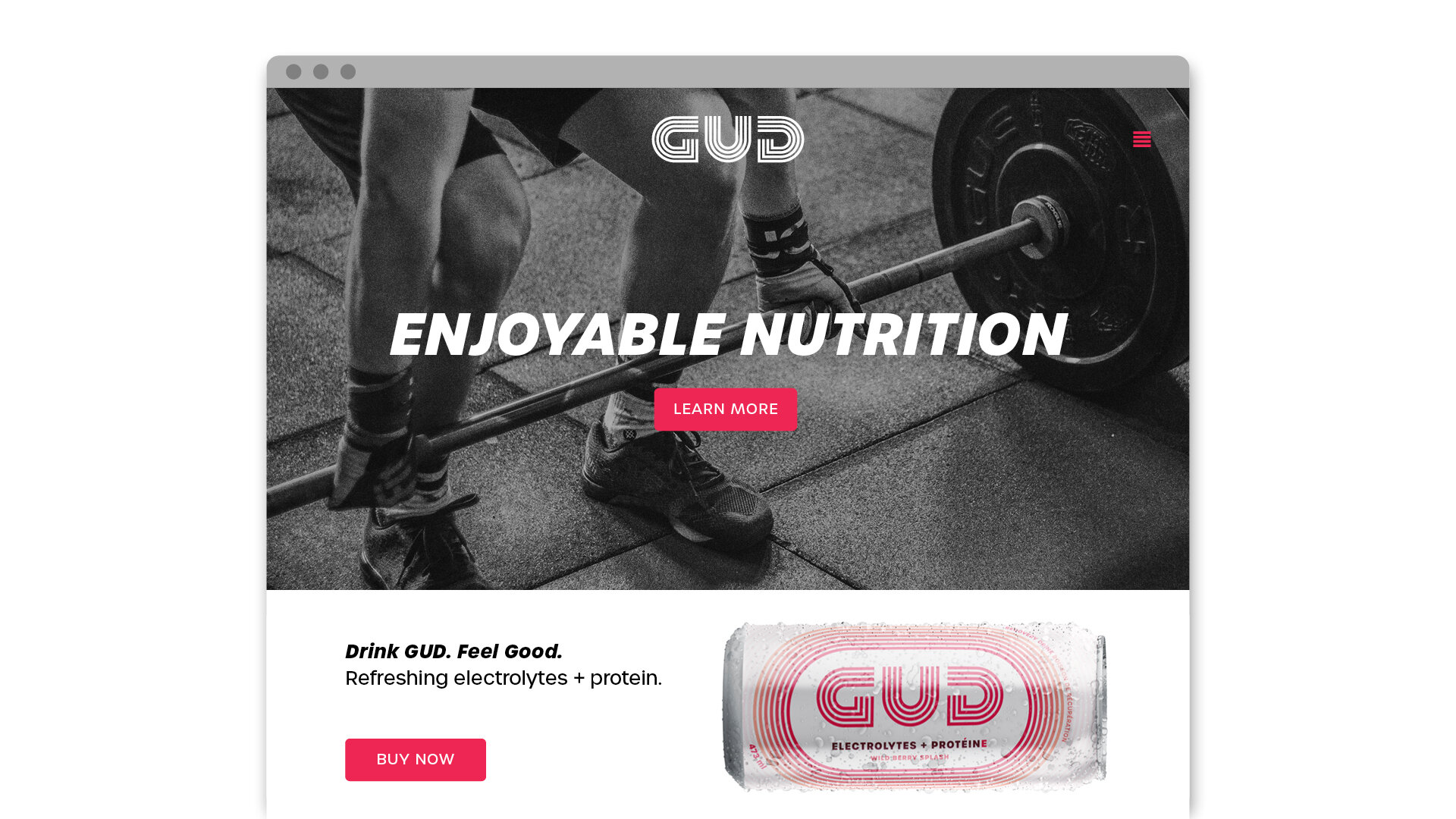
Here Be Monsters branded GUD as the refreshing foil to the overtly aggressive competitors in the sports nutrition market. We went on to state, GUD believes sports and training must be enjoyed and athletes should enjoy what they do. Or else, why do it at all?
This brand spirit was directly inspired by the strategy and product truth. GUD makes enjoyable nutrition. Anyone that compares their recovery drink against the chalky and heavy competitors immediately gets it.
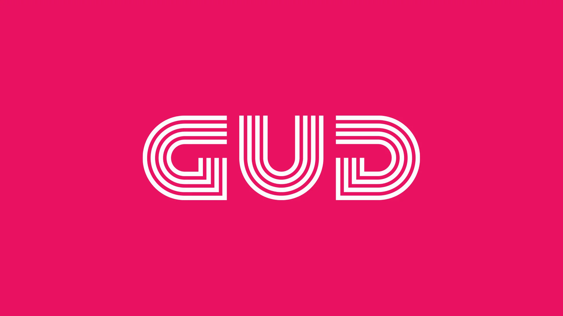
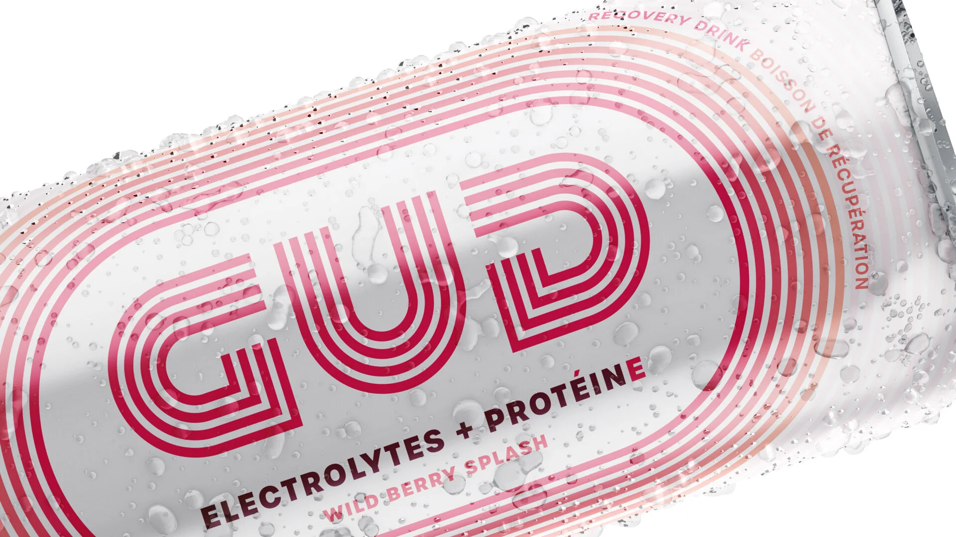
The key was demonstrating the enjoyment and dynamism in the logo and package design. Inspired by the lanes of Olympic pools and running tracks, along with the graphic markings in other athletic fields, Here Be Monsters developed the GUD wordmark through repeated line work to make a strong and yet playful logo.
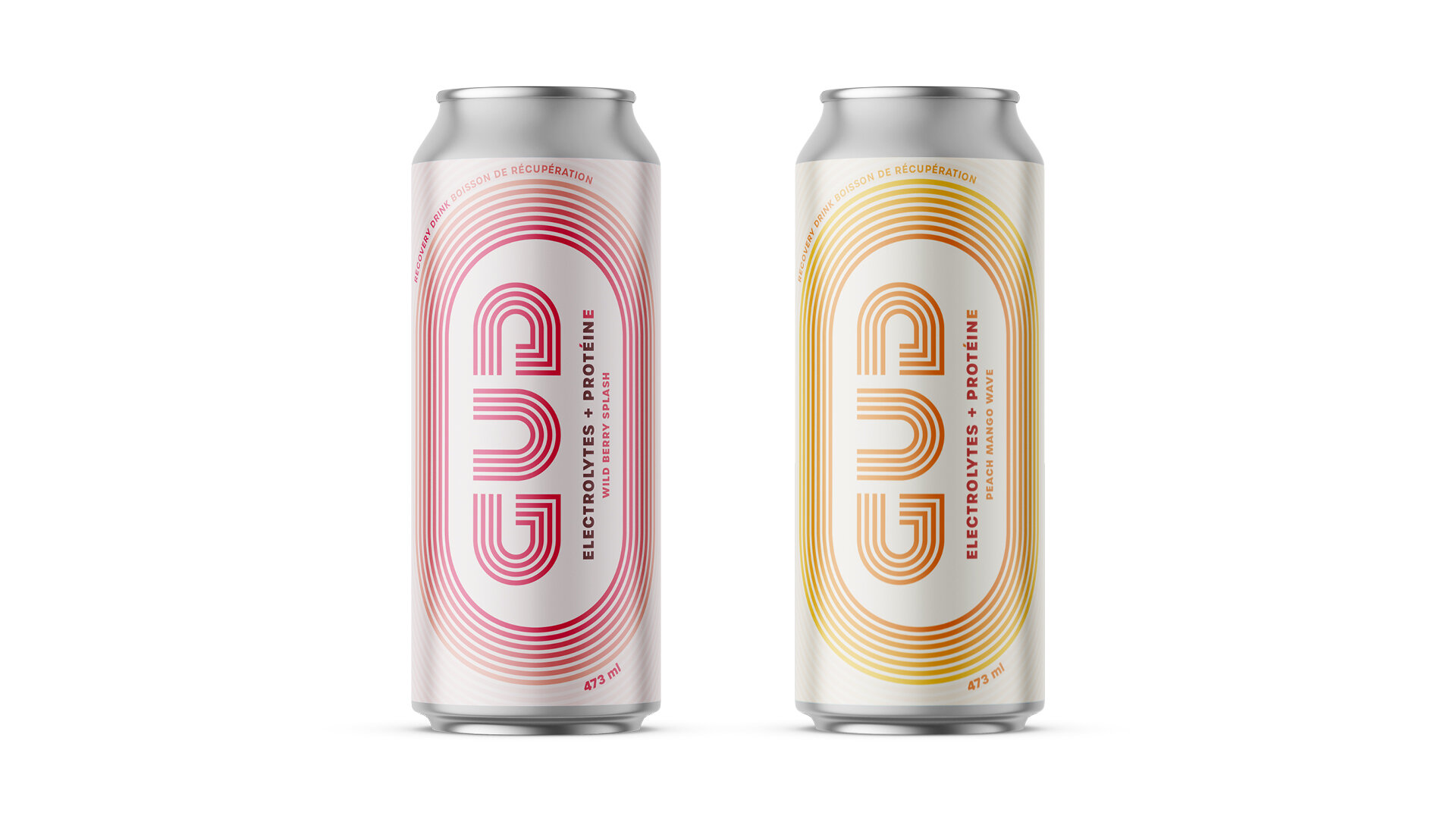
Finally, just like a running track, the packaging was finished with concentric ovals looping around the GUD wordmark to create a button-like container that demands attention.
Put all together, the design system reflects the brand positioning; evoking the precise nature of sports nutrition balanced with bright, lively hues to keep the enjoyable drinks light and approachable for athletes of every level.


Enzo Garofalo,
Founder and Chief Athletic Officer at Ezry Foods Inc.