
Crafting a multi-faceted photographer’s brand
Lindsay Siu
Brand Identity
Logo
Marketing Collateral
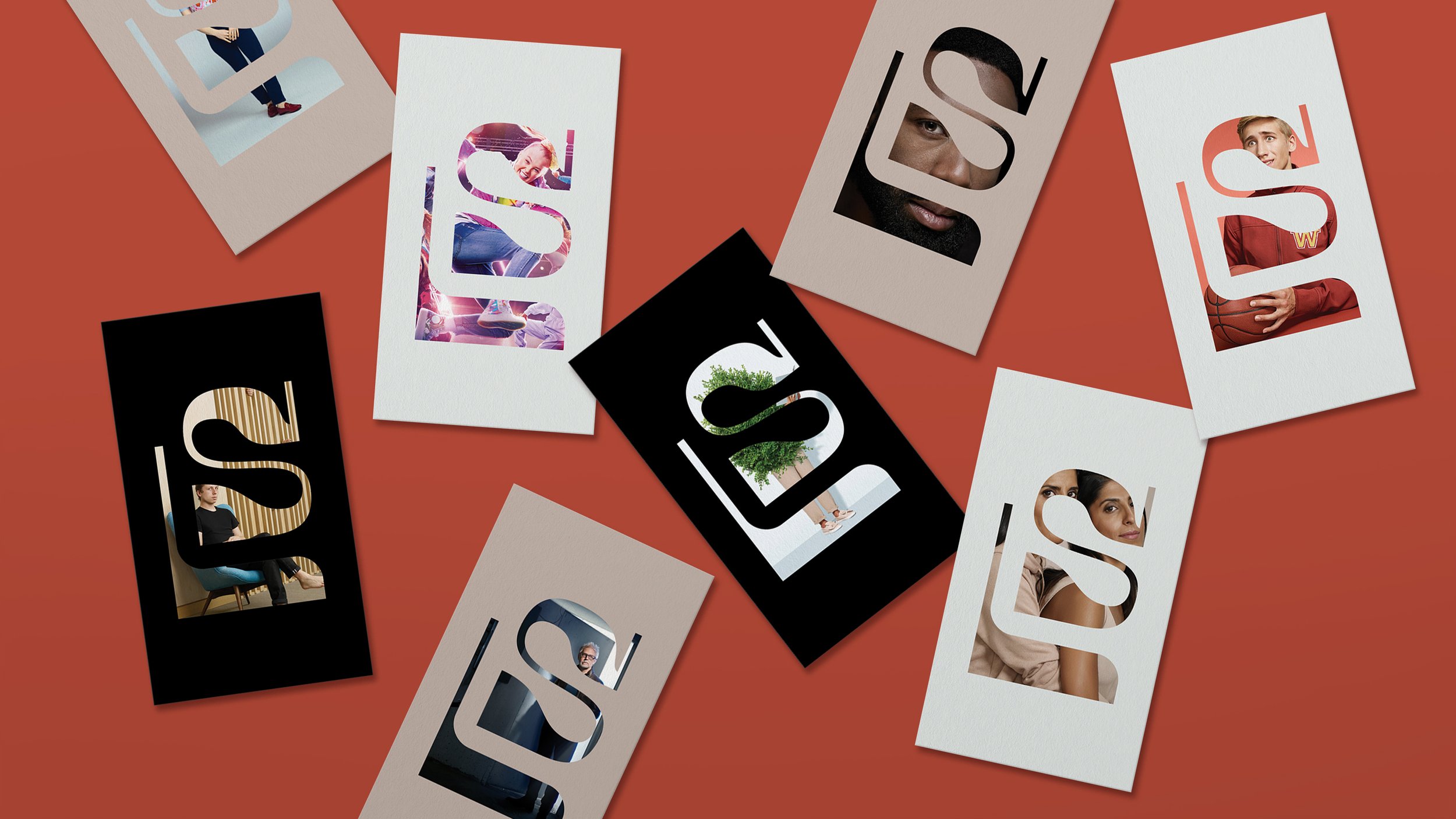
Too many photographers just choose a typeset wordmark as their brand identity. Perhaps they believe their work will set them apart. Perhaps they're too busy fiddling with lenses. Perhaps 99% of all photographers just really like Helvetica. Regardless, Lindsay Siu wanted to stand out from the rest and demonstrate her multi-faceted skillset through a new brand.
Lindsay is a multi-talented photographer and director. She works with all types of subjects from kids to celebrities and everyone in between, and these facts needed to be reflected in her branding.
The answer was a brand system that echoes her multi-faceted creative pursuits, displaying a variety of images through the monogram in all of her branded touch points. And, her wordmark literally displays different styles for the different letter characters. Just like the people in front of her lens.


Creating the wordmark’s characters from scratch allowed us to continue the typographic expression using Chinese characters, reflecting her multi-faceted approach and a perspective of her Chinese Canadian identity.
