


Growing the value of a healthy brand
Nature’s Fare Markets
Brand Strategy
Logo
Identity System
Advertising
Nature’s Fare Markets were stuck in the middle. On one side were big-box value-brand grocery stores using bright colours and simplistic imagery along with a low-cost design sense. And on the other, side premium brands were carrying similar products to Nature’s Fare, but within luxurious stores that had more refined design sensibilities.
It was time for Nature’s Fare to up its branding game, so they reached out to Here Be Monsters.

First, we did our homework. We conducted internal and external stakeholder interviews and held a brand workshop with executives and rank-and-file employees. Together, we learned that balancing health & wellness, family, community, and our planet was a shared value of both Nature’s Fare and its customers. We also learned that maintaining that balance takes energetic and caring people. In fact, this insight led to the new brand position: Purveyors of Harmony.
To express this position and stand apart from the competition, we revamped the entire brand starting with the visual identity. After much internal debate, we kept the apple in their logo. It is and always will be a symbol of freshness and knowledge, but we saw opportunities to refine the icon and modernize the typography.
Next, the brand toolkit was completely reimagined to be a cohesive family of design including: a custom, hand-crafted font called NFM Marker, a new colour palette inspired by organic produce, a new illustration style and suite of assets, along with a whole new tone-of-voice.
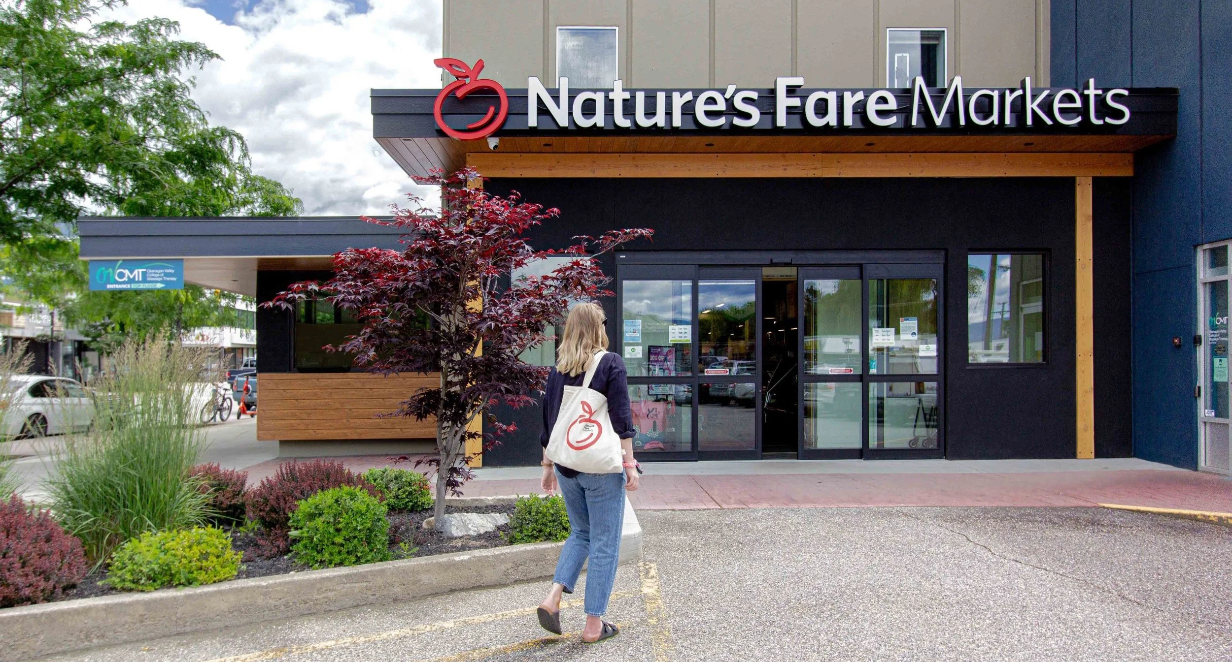


Then we applied the new brand as a customer experience plan; with exterior signs and in-store signage, weekly flyers, their website and social media, reusable bags, name tags, receipts, and more getting completely refreshed.
Now, legacy Nature’s Fare stores are getting facelifts and new stores are confidently taking on the competition. No longer stuck in the middle, they’ve carved out a unique new space for themselves, while remaining true to their organic roots.


Brand Campaign
As we all know, the first step after a rebranding project is to attract new people to your business. For Nature’s Fare Markets, this meant rolling out a multi-channel brand campaign that included out-of-home, pre-roll & social video, digital display and radio advertising.
In essence, the campaign needed to affirm Nature’s Fare as a source for all things good and knowledgeable. It’s not just a niche health food shop, it’s a place where you can get great food at a good price for any kind of diet. And, if you don’t know exactly what you’re looking for, they have well-informed employees in every aisle.


“Our team now has all the brand tools we need to make an impact.
Exactly what we were looking for.”
Stephanie Thatcher,
Director of Marketing