
A progressive take on private school
West Point Grey Academy
Strategy
Writing
Logo
Identity System
Brand Guidelines
West Point Grey Academy doesn’t fit the typical private school image. It isn’t weighed down by centuries of tradition or dusty graduate photos from the 1920’s. At only 30 years old, WPGA is modern, progressive, and focused on creating a culture where students can thrive and grow into the best version of themselves.
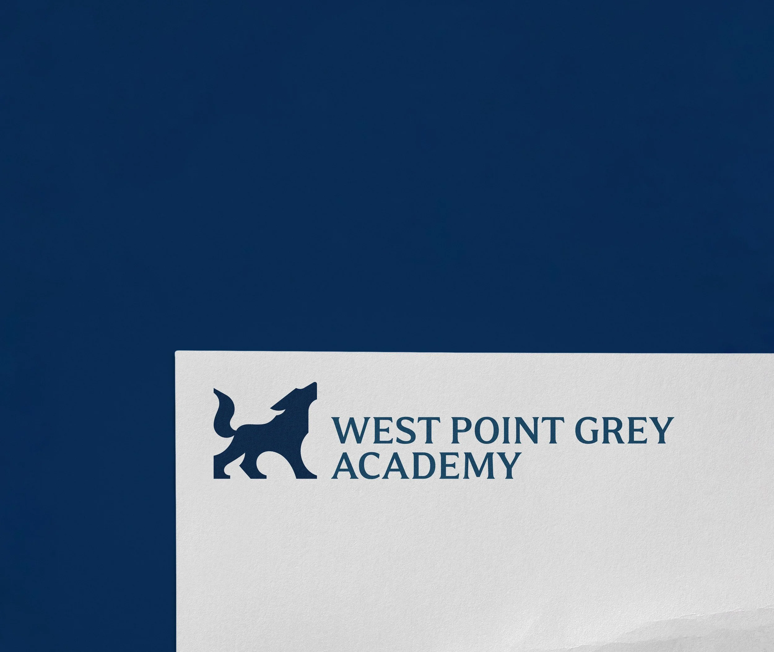
Our rebrand needed to reflect that difference. The answer was to elevate the wolf, previously just the team mascot, into a symbol for the entire school community. The wolf captures the school’s character: looking forward with vision, standing strong with confidence, and leading with empathy and purpose.
The new mark is refined and contemporary, with clean curves and stable, serif-inspired bases. It balances elegance with strength and was designed with timelessness in mind. The wolf is an identity that honours WPGA’s heritage while confidently looking ahead.
The colour palette builds on the school’s established navy, adding grey tones for stability, turquoise for calmness, and a vibrant yellow accent to demonstrate energy and optimism. Together, these colours bring balance and freshness to the brand.
WPGA’s new voice is equally important. Its tones are warm, optimistic, energetic, and empowering. And, they’re designed to feel personal, inspire confidence, and bring the community together.
This rebrand positions West Point Grey Academy as a school that stands apart from the traditional private school model. It proves their progressive, caring culture that empowers students, families, and faculty alike.
Now, the wolf represents the spirit of WPGA and leads the way into the future.


